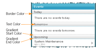
Depending on whether you access the Mobile Brand Administration page from the organization or org unit level, you may not have access to all settings.
The Mobile Web navbar does not reproduce settings from the Navbar tool.
Area |
Description |
Example |
|---|---|---|
General |
||
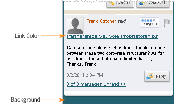
Background |
Sets the color that appears behind main content interface elements. |
|
Link Color |
Sets the color of system links. |
|
Navbar |
||
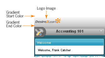
Logo Image |
Sets the image that appears at the top of every screen on the navbar. Use this option to tailor your Mobile Web navbar to match your institution's logo or crest. The dimensions of your image should be no larger than 200 x 50 pixels to fit correctly on mobile screens. |
|
Fill Type |
Sets the type of background for the navbar area. You can choose between a solid or gradient background. Once you select the fill type, corresponding color options appear. |
|
Page Title |
||
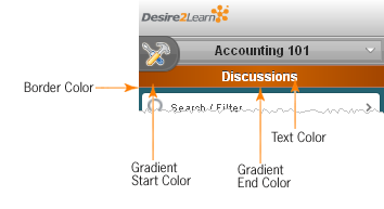
Fill Type |
Sets the type of background for the page title bar. You can choose between a solid or gradient background. Once you select the fill type, corresponding color options appear. |
|
Border Color |
Sets the color of a thin border on the bottom of the page title area. |
|
Text Color |
Sets the color of the page title text. |
|
Headings |
||
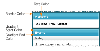
Fill Type |
Sets the type of background for the heading bar. You can choose between a solid or gradient background. Once you select the fill type, corresponding color options appear. |
|
Border Color |
Sets the color of a thin border on the top and sides of the heading area. |
|
Text Color |
Sets the color of the heading text. |
|
Subheadings |
||
Fill Type |
Sets the type of background for the subheading bar. You can choose between a solid or gradient background. Once you select the fill type, corresponding color options appear. |
|
Border Color |
Sets the color of a thin dotted border on the bottom of the subheading area. |
|
Text Color |
Sets the color of the subheading text. |
|
